在Qt中可以通过QSS对菜单进行样式设置,而且对于非标准菜单项我也可以通过自定义Widget的方法来实现,本文讲述在Qt中QMenu的使用方法。
一、菜单基本使用
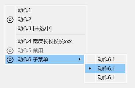
下面示例演示了右键菜单的创建方法,该菜单包含了图标、选中/未选中状态、二级菜单、互斥选择等常用菜单特性,代码如下:
1
2
3
4
5
6
7
8
9
10
11
12
13
14
15
16
17
18
19
20
21
22
23
24
25
26
27
28
29
30
31
32
33
34
35
36
37
38
39
40
41
42
43
44
45
46
47
48
49
50
51
52
53
54
55
56
57
58
59
60
| QIcon settingIcon(":/MenuBeauty/setting.png");
QAction* action1 = new QAction("动作1");
QAction* action2 = new QAction(settingIcon, "动作2 有图标");
QAction* action3 = new QAction("动作3 [未选中]");
action3->setCheckable(true);
action3->setChecked(false);
connect(action3, &QAction::triggered, this, [action3](bool checked) {
action3->setText(checked ? "动作3 [选中]" : "动作3 [未选中]");
});
QAction* action4 = new QAction("Action4 动作四测试");
QAction* action5 = new QAction(settingIcon, "动作5 禁用");
action5->setEnabled(false);
QAction* action6 = new QAction(settingIcon, "动作6 子菜单");
{
QAction* action6_1 = new QAction("动作6.1");
action6_1->setCheckable(true);
QAction* action6_2 = new QAction("动作6.1");
action6_2->setCheckable(true);
QAction* action6_3 = new QAction("动作6.1");
action6_3->setCheckable(true);
QMenu* action6SubMenu = new QMenu(this);
action6SubMenu->addAction(action6_1);
action6SubMenu->addAction(action6_2);
action6SubMenu->addAction(action6_3);
QActionGroup* action6Group = new QActionGroup(this);
action6Group->setExclusive(true);
action6Group->addAction(action6_1);
action6Group->addAction(action6_2);
action6Group->addAction(action6_3);
action6->setMenu(action6SubMenu);
}
QMenu* menu = new QMenu(this);
menu->addActions({action1, action2, action3});
menu->addSeparator();
menu->addActions({action4, action5, action6});
this->setContextMenuPolicy(Qt::CustomContextMenu);
connect(this, &QWidget::customContextMenuRequested, this, [this, menu](const QPoint& pos) {
menu->exec(this->mapToGlobal(pos));
});
|
上述菜单未经过任何美化,样式如下图所示:

二、使用QSS美化菜单
现在我们使用如下QSS对上面创建的菜单进行美化,可以美化的项包含背景、文本颜色、边距、图标等。
为了使大家不被颜色值所困扰,下面QSS中的颜色统一使用颜色名称表示。
1
2
3
4
5
6
7
8
9
10
11
12
13
14
15
16
17
18
19
20
21
22
23
24
25
26
27
28
29
30
31
32
33
34
35
36
37
38
39
40
41
42
43
44
45
46
47
48
49
50
51
52
53
54
55
56
57
58
59
60
61
62
63
64
65
66
67
68
69
70
71
72
|
QMenu {
border: 1px solod red;
border-radius: 10px;
background-color: blue;
font-size: 14px;
font-family: "Microsoft YaHei";
min-width: 160px;
padding: 10px 0px 10px 0px;
}
QMenu::item {
border: none;
background-color: transparent;
color: white;
min-height: 20px;
min-width: 160px;
padding: 8px 8px;
}
QMenu::item:selected {
background-color: green;
color: black;
}
QMenu::item:disabled {
background-color: gray;
color: white;
}
QMenu::separator {
height: 1px;
background-color: red;
margin: 0x 6px 0px 6px;
}
QMenu::icon {
width: 12px;
height: 12px;
margin: 0 0 0 12px;
}
QMenu::indicator:non-exclusive:checked, QMenu::indicator:exclusive:checked {
width: 12px;
height: 12px;
margin: 0 0 0 8px;
image: url(:/MenuBeauty/check.png);
}
QMenu::indicator:non-exclusive:unchecked, QMenu::indicator:exclusive:unchecked {
width: 12px;
height: 12px;
margin: 0 0 0 8px;
image: url(:/MenuBeauty/unchecked.png);
}
|
为了使菜单的圆角生效,我们还需要移除菜单的边框、阴影,并将背景设置为透明,代码如下:
1
2
3
4
5
| menu->setWindowFlags(action6SubMenu->windowFlags() |
Qt::FramelessWindowHint |
Qt::NoDropShadowWindowHint
);
menu->setAttribute(Qt::WA_TranslucentBackground);
|
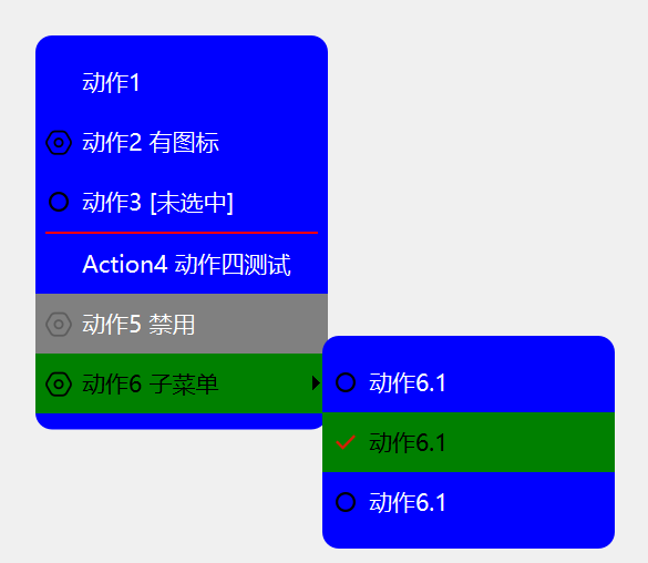
美化后的菜单如下图所示:
QMenu支持QSS盒子模型,其通用属性如下:
1
2
3
4
5
6
7
8
| border
border-radius
margin
padding
background
color
font
border-image
|
QSS还可以对QMenu的子控件进行设置,支持QMenu子控件如下:
1
2
3
4
5
6
7
| item
indicator
separator
right-arrow
left-arrow
scroller
tearoff
|
QMenu不支持伪状态,只有其子控件支持伪状态,支持的伪状态如下:
1
2
3
4
| default
selected
exclusive
non-exclusive
|
具体的子控件和伪状态的含义,可以参考 QSS基本使用方法 文章。
三、自定义菜单项
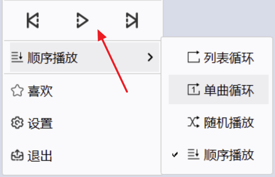
大多数情况下,上述常规的菜单项就可以满足要求,但在有些情况下,我们的菜单项可能由更加复杂的Widget组合而成,比如下面播放器的菜单:
我们可以使用QWidgetAction来实现上述菜单效果,QWidgetAction可以将一个QWidget放入菜单项的容器内,从而实现自定义菜单项。
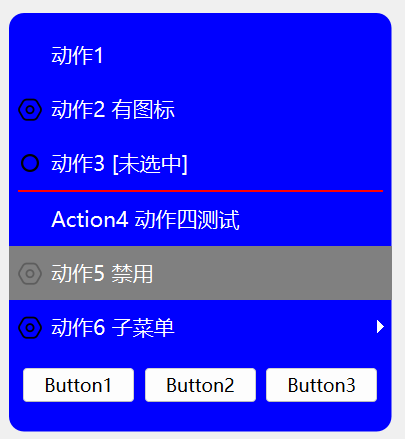
下面代码定义了一个包含3个按钮的菜单项,点击按钮会弹出对话框:
1
2
3
4
5
6
7
8
9
10
11
12
13
14
15
16
17
18
19
20
21
| QWidgetAction* action7 = new QWidgetAction(this);
{
QWidget* widget = new QWidget();
QHBoxLayout* hl = new QHBoxLayout(widget);
auto createPushButtonFn = [this](QString title) {
QPushButton* btn = new QPushButton(title);
connect(btn, &QPushButton::clicked, this, [this]() {
QMessageBox::information(this, "Clicked", ((QPushButton*)sender())->text());
});
return btn;
};
hl->addWidget(createPushButtonFn("Button1"));
hl->addWidget(createPushButtonFn("Button2"));
hl->addWidget(createPushButtonFn("Button3"));
action7->setDefaultWidget(widget);
}
menu->addAction(action7);
|
效果如图所示:
我们也可以使用QSS对菜单项内的控件进行样式设置,如:
1
2
3
4
5
6
| QMenu QPushButton {
border: none;
border-radius: 10px;
background-color: black;
color: white;
}
|


