本文整理了一些在使用 Qt 框架过程中遇到的实际问题及其解决方案。内容源自日常开发笔记,偏重实用,虽未刻意追求系统性的篇章结构,但希望能为遇到类似情况的开发者提供参考。
路径相关
当前程序可执行文件的据对路径QCoreApplication::applicationFilePath()
当前程序可执行文件所在的目录QCoreApplication::applicationDirPath()
当前进程的工作目录QDir::currentPath(),在调用 CreateProcess 函数时通过 lpCurrentDirectory 参数指定进程工作目录
通过文件路径获取文件相关信息1 2 3 4 QFileInfo fi ("D:/1/2/3 4.txt" ) ;qDebug () << fi.dir ().path (); qDebug () << fi.fileName (); qDebug () << fi.suffix ();
<原文出自: jiangxueqiao.com,请尊重原创>
QEnum 转字符串 1 2 3 4 template <typename QEnum>inline const char * QEnumToStr (const QEnum value) return QMetaEnum::fromType <QEnum>().valueToKey (value); }
移除 Qt 控件虚线框 方式一:使用 StyleSheet 1 2 3 QWidget:focus { outline : none; }
方式二:继承 QProxyStyle 继承 QProxyStyle,PrimitiveElement 为 QStyle::PE_FrameFocusRect 时不绘制虚线框,然后在 main() 函数里调用 QApplication::setStyle() 使用新的样式。
1 2 3 4 5 6 7 8 9 10 11 12 13 14 15 16 17 18 19 20 21 #ifndef NOFOCUSRECTSTYLE_H #define NOFOCUSRECTSTYLE_H #include <QProxyStyle> class NoFocusRectStyle : public QProxyStyle{ public : NoFocusRectStyle (QStyle *baseStyle) : QProxyStyle (baseStyle) {} void drawPrimitive (PrimitiveElement element, const QStyleOption *option, QPainter *painter, const QWidget *widget = 0 ) const if (element == QStyle::PE_FrameFocusRect) { return ; } QProxyStyle::drawPrimitive (element, option, painter, widget); } }; #endif
1 2 3 4 5 6 7 8 9 10 11 12 13 #include "Widget.h" #include "NoFocusRectStyle.h" #include <QApplication> int main (int argc, char *argv[]) QApplication app (argc, argv) ; NoFocusRectStyle *style = new NoFocusRectStyle (app.style ()); app.setStyle (style); Widget w; w.show (); return app.exec (); }
一般而言,只需要做如下操作,QWidget 即可支持拖入文件:
1 2 3 4 5 6 7 8 setDragDropMode (QAbstractItemView::DropOnly); void dragEnterEvent (QDragEnterEvent* e) override void dropEvent (QDropEvent* e) override
但在执行上述操作后,我们拖入文件到 QListWidget 时,却只能收到 dragEnterEvent 事件,却无法收到 dropEvent 事件。
因为还需要重写 dragMoveEvent 方法,如:
1 2 3 void dragMoveEvent (QDragMoveEvent* e) e->acceptProposedAction (); }
QListWidget 添加 item 的方法如下:
1 2 3 4 5 6 QListWidget* list = new QListWidget (); QListWidgetItem* item = new QListWidgetItem (); list->addItem (item);
如需要自定义 Item 的布局,还可以通过自定义 Widget 来实现,如:
1 2 3 4 5 6 7 8 9 QListWidget* list = new QListWidget (); QListWidgetItem* item = new QListWidgetItem (); list->addItem (item); CustomWidget * customWidget = new CustomWidget (); list->setItemWidget (item, customWidget);
此时,我们还没有为 item 设置 size hint,item 会自动根据 item 的数据(如 text)计算 size hint。但如果是自定义的 Widget,则无法自动计算 size hint,需要手动设置 size hint,如:
1 2 3 4 5 6 int vScrollbarWidth = 0 ;if (verticalScrollBar ()) vScrollbarWidth = verticalScrollBar ()->width (); item->setSizeHint (QSize (list->width () - vScrollbarWidth, widget->height ()));
QListWidget 的滚动条默认显示策略是ScrollBarAsNeeded,当宽度不够显示 Item 时,滚动条就会显示出来,此时虽然 QListWidget 宽度改变了,但 Item 的宽度却不会改变,Item 不会收到 ResizeEvent 事件。如需 Item 的宽度跟随 QListWidget 宽度而改变,则需要关闭滚动条显示,并在 QListWidget 的 ResizeEvent 事件中实时设置每个 Item 的 size hint,代码如下:
1 2 list->setHorizontalScrollBarPolicy (Qt::ScrollBarAlwaysOff);
1 2 3 4 5 6 7 8 9 10 11 12 13 14 15 16 17 18 void FileList::resizeEvent (QResizeEvent* e) int vScrollbarWidth = 0 ; if (verticalScrollBar ()) vScrollbarWidth = verticalScrollBar ()->width (); int w = width (); int cnt = count (); for (int i = 0 ; i < cnt; i++) { QListWidgetItem* it = item (i); if (it) { CustomWidget* customWidget = dynamic_cast <CustomWidget*>(itemWidget (it)); if (customWidget) { it->setSizeHint (QSize (w - vScrollbarWidth, customWidget->height ())); } } } QListWidget::resizeEvent (e); }
子线程中更新 UI 方法 1: 使用信号槽 这是一种非常常规的方式,通过自定义信号、槽,连接该信号和槽,在子线程中发送信号,在槽中更新 UI。
定义信号和槽:
1 2 3 4 signals: void updateUi (int v) private slots: void onUpdateUi (int v)
在子线程中发送信号:
1 2 3 4 5 6 7 8 9 10 connect (this , &UpdateUIInSubThread::updateUi, this , &UpdateUIInSubThread::onUpdateUi, Qt::AutoConnection);std::thread t = std::thread ([this ]() { for (int i = 0 ; i < 10000 ; i++) { emit updateUi (i); std::this_thread::sleep_for (std::chrono::milliseconds (50 )); } }); t.detach ();
在槽函数中更新 UI:
1 2 3 4 void UpdateUIInSubThread::onUpdateUi (int v) ui.label->setText (QString::number (v)); }
这种方式需要单独额外定义信号和槽,使用起来比较繁琐。
方法 2: 使用 invokeMethod QMetaObject::invokeMethod 函数的原型如下:
1 template <typename Functor, typename FunctorReturnType> bool QMetaObject::invokeMethod (QObject *context, Functor function, Qt::ConnectionType type = Qt::AutoConnection, FunctorReturnType *ret = nullptr )
该函数可以在context的事件循环中执行function函数。
1 2 3 4 5 6 7 8 9 10 11 12 std::thread t = std::thread ([this ]() { for (int i = 0 ; i < 10000 ; i++) { if (QMetaObject::invokeMethod (this , [i, this ]() { ui.label->setText (QString::number (i)); })) { qDebug () << "Update UI success" ; } std::this_thread::sleep_for (std::chrono::milliseconds (50 )); } }); t.detach ();
由于在子线程中更新 UI,因此信号和槽肯定使用的是 QueuedConnection 的连接方式,所以无法将FunctorReturnType返回给调用者,否则会出现如下错误:
1 QMetaObject::invokeMethod: Unable to invoke methods with return values in queued connections
当然上述示例中也可以不使用 lambda 表达式,直接调用槽函数:
1 2 3 4 5 6 7 8 std::thread t = std::thread ([this ]() { for (int i = 0 ; i < 10000 ; i++) { QMetaObject::invokeMethod (this , "onUpdateUi" , Qt::AutoConnection, Q_ARG (int , i)); std::this_thread::sleep_for (std::chrono::milliseconds (50 )); } }); t.detach ();
加载字体文件 如何使用 Qt 加载外部字体文件,并遍历字体名称和样式名称。
1 2 3 4 5 6 7 8 9 10 11 12 13 14 15 16 17 18 19 20 21 22 23 24 25 26 27 28 29 30 31 32 33 34 35 36 37 38 bool LoadFont (const QString& fontPath) const int fontId = QFontDatabase::addApplicationFont (fontPath); if (fontId == -1 ) { return false ; } #if QT_VERSION >= QT_VERSION_CHECK(6, 0, 0) const QStringList fontFamilyList = fontDb.applicationFontFamilies (fontId); QString fontFamily; foreach (fontFamily, fontFamilyList) { qDebug () << "Family:" << fontFamily; const QStringList fontStyleList = QFontDatabase::styles (fontFamily); QString fontStyle; foreach (fontStyle, fontStyleList) { qDebug () << "\tStyle:" << fontStyle; } } #else QFontDatabase fontDb; const QStringList fontFamilyList = fontDb.applicationFontFamilies (fontId); QString fontFamily; foreach (fontFamily, fontFamilyList) { qDebug () << "Family:" << fontFamily; const QStringList fontStyleList = fontDb.styles (fontFamily); QString fontStyle; foreach (fontStyle, fontStyleList) { qDebug () << "\tStyle:" << fontStyle; } } #endif return true ; }
QWidget 子类无法应用 QSS 样式的问题是一个老生常谈的问题,在使用 Qt 进行界面开发时,我们经常会继承自 QWidget 来实现自定义控件(当然这里说的是非顶级窗口),此时我们发现在该自定义控件上应用 QSS 样式会无效。
导致这个问题的主要原因是 QWidget 的 paintEvent 函数实现为空,未做任何绘制,也没有对样式表进行初始化和绘制,其代码如下:
1 2 void QWidget::paintEvent (QPaintEvent *) }
解决这个问题也比较简单,在 QWidget 子类的 paintEvent 函数中初始化并绘制样式表:
1 2 3 4 5 6 void CustomWidget::paintEvent (QPaintEvent* e) QStyleOption opt; opt.init (this ); QPainter p (this ) ; style ()->drawPrimitive (QStyle::PE_Widget, &opt, &p, this ); }
当然我们也可以采用变通的方法,改为继承自QFrame,因为 QFrame 默认初始化和绘制了样式表,其代码如下:
1 2 3 4 5 6 7 8 9 10 11 12 13 14 15 16 17 void QFrame::paintEvent (QPaintEvent *) QPainter paint (this ) ; drawFrame (&paint); } void QFrame::drawFrame (QPainter *p) QStyleOptionFrame opt; initStyleOption (&opt); style ()->drawControl (QStyle::CE_ShapedFrame, &opt, p, this ); }
QSS 设置滚动条的样式 <原文出自: jiangxueqiao.com,请尊重原创>
1 2 3 4 5 6 7 8 9 10 11 12 13 14 15 16 17 18 19 20 21 22 23 24 25 26 27 28 29 30 31 32 33 34 35 36 37 38 39 40 41 42 43 44 45 46 47 48 49 50 51 52 53 54 55 56 57 58 59 60 61 62 63 64 65 66 67 68 69 70 71 72 73 74 75 76 77 78 79 80 81 82 83 84 85 86 87 88 89 90 91 92 93 94 95 96 97 98 99 100 101 102 103 104 105 106 107 108 109 110 111 112 113 114 115 116 117 118 119 120 121 122 123 124 125 126 127 128 129 130 131 132 133 134 135 136 137 138 139 140 141 142 143 144 145 146 147 148 149 150 151 152 153 154 155 156 157 158 159 160 161 162 163 QScrollBar:vertical { background : transparent; width : 10px ; margin : 0px 0px 0px 0px ; padding-top : 12px ; padding-bottom : 12px ; } QScrollBar:horizontal { background : transparent; height : 10px ; margin : 0px 0px 0px 0px ; padding-left : 12px ; padding-right : 12px ; } QScrollBar:vertical:hover, QScrollBar:horizontal:hover { background : rgba (0 , 0 , 0 , 30 ); border-radius : 5px ; } QScrollBar::handle:vertical { background : rgba (0 , 0 , 0 , 50 ); width : 10px ; border-radius : 5px ; border : none; } QScrollBar::handle:horizontal { background : rgba (0 , 0 , 0 , 50 ); height : 10px ; border-radius : 5px ; border : none; } QScrollBar::handle:vertical:hover, QScrollBar::handle:horizontal:hover { background : rgba (0 , 0 , 0 , 100 ); } QScrollBar::add-page:vertical { width : 10px ; background : transparent; } QScrollBar::sub-page:vertical { width : 10px ; background : transparent; } QScrollBar::add-page:horizontal { height : 10px ; background : transparent; } QScrollBar::sub-page:horizontal { height : 10px ; background : transparent; } QScrollBar::sub-line:vertical { height : 12px ; width : 10px ; background : transparent; subcontrol-position : top; } QScrollBar::up-arrow:vertical { image : url (:/client/images/scrollbar_arrowup_normal.png ); } QScrollBar::up-arrow:vertical:hover { image : url (:/client/images/scrollbar_arrowup_down.png ); } QScrollBar::up-arrow:vertical:pressed { image : url (:/client/images/scrollbar_arrowup_highlight.png ); } QScrollBar::add-line:vertical { height : 12px ; width : 10px ; background : transparent; subcontrol-position : bottom; } QScrollBar::down-arrow:vertical { image : url (:/client/images/scrollbar_arrowdown_normal.png ); } QScrollBar::down-arrow:vertical:hover { image : url (:/client/images/scrollbar_arrowdown_down.png ); } QScrollBar::down-arrow:vertical:pressed { image : url (:/client/images/scrollbar_arrowdown_highlight.png ); } QScrollBar::sub-line:horizontal { height : 10px ; width : 12px ; background : transparent; subcontrol-position : left; } QScrollBar::left-arrow:horizontal { image : url (:/client/images/scrollbar_arrowleft_normal.png ); } QScrollBar::left-arrow:horizontal:hover { image : url (:/client/images/scrollbar_arrowleft_down.png ); } QScrollBar::left-arrow:horizontal:pressed { image : url (:/client/images/scrollbar_arrowleft_highlight.png ); } QScrollBar::add-line:horizontal { height : 10px ; width : 12px ; background : transparent; subcontrol-position : right; } QScrollBar::right-arrow:horizontal { image : url (:/client/images/scrollbar_arrowright_normal.png ); } QScrollBar::right-arrow:horizontal:hover { image : url (:/client/images/scrollbar_arrowright_down.png ); } QScrollBar::right-arrow:horizontal:pressed { image : url (:/client/images/scrollbar_arrowright_highlight.png ); }
自定义和美化菜单 在 Qt 中可以通过 QSS 对菜单进行样式设置,而且对于非标准菜单项我也可以通过自定义 Widget 的方法来实现,本文讲述在 Qt 中 QMenu 的使用方法。
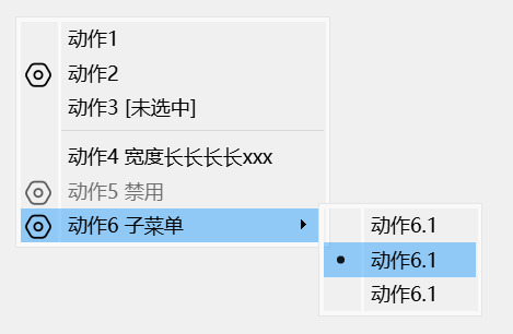
菜单基本使用 下面示例演示了右键菜单的创建方法,该菜单包含了图标、选中/未选中状态、二级菜单、互斥选择等常用菜单特性,代码如下:
1 2 3 4 5 6 7 8 9 10 11 12 13 14 15 16 17 18 19 20 21 22 23 24 25 26 27 28 29 30 31 32 33 34 35 36 37 38 39 40 41 42 43 44 45 46 47 48 49 50 51 52 53 54 55 56 57 58 59 60 QIcon settingIcon (":/MenuBeauty/setting.png" ) ;QAction* action1 = new QAction ("动作1" ); QAction* action2 = new QAction (settingIcon, "动作2 有图标" ); QAction* action3 = new QAction ("动作3 [未选中]" ); action3->setCheckable (true ); action3->setChecked (false ); connect (action3, &QAction::triggered, this , [action3](bool checked) { action3->setText (checked ? "动作3 [选中]" : "动作3 [未选中]" ); }); QAction* action4 = new QAction ("Action4 动作四测试" ); QAction* action5 = new QAction (settingIcon, "动作5 禁用" ); action5->setEnabled (false ); QAction* action6 = new QAction (settingIcon, "动作6 子菜单" ); { QAction* action6_1 = new QAction ("动作6.1" ); action6_1->setCheckable (true ); QAction* action6_2 = new QAction ("动作6.1" ); action6_2->setCheckable (true ); QAction* action6_3 = new QAction ("动作6.1" ); action6_3->setCheckable (true ); QMenu* action6SubMenu = new QMenu (this ); action6SubMenu->addAction (action6_1); action6SubMenu->addAction (action6_2); action6SubMenu->addAction (action6_3); QActionGroup* action6Group = new QActionGroup (this ); action6Group->setExclusive (true ); action6Group->addAction (action6_1); action6Group->addAction (action6_2); action6Group->addAction (action6_3); action6->setMenu (action6SubMenu); } QMenu* menu = new QMenu (this ); menu->addActions ({action1, action2, action3}); menu->addSeparator (); menu->addActions ({action4, action5, action6}); this ->setContextMenuPolicy (Qt::CustomContextMenu);connect (this , &QWidget::customContextMenuRequested, this , [this , menu](const QPoint& pos) { menu->exec (this ->mapToGlobal (pos)); });
上述菜单未经过任何美化,样式如下图所示:
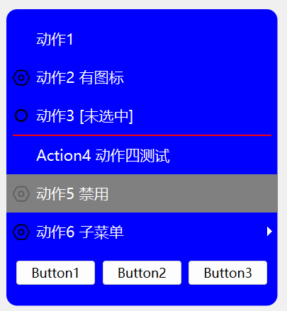
使用 QSS 美化菜单 现在我们使用如下 QSS 对上面创建的菜单进行美化,可以美化的项包含背景、文本颜色、边距、图标等。
为了使大家不被颜色值所困扰,下面 QSS 中的颜色统一使用颜色名称表示。
1 2 3 4 5 6 7 8 9 10 11 12 13 14 15 16 17 18 19 20 21 22 23 24 25 26 27 28 29 30 31 32 33 34 35 36 37 38 39 40 41 42 43 44 45 46 47 48 49 50 51 52 53 54 55 56 57 58 59 60 61 62 63 64 65 66 67 68 69 70 71 72 73 74 QMenu { border : 1px solod red; border-radius : 10px ; background-color : blue; font-size : 14px ; font-family : "Microsoft YaHei" ; min-width : 160px ; padding : 10px 0px 10px 0px ; } QMenu::item { border : none; background-color : transparent; color : white; min-height : 20px ; min-width : 160px ; padding : 8px 8px ; } QMenu::item:selected { background-color : green; color : black; } QMenu::item:disabled { background-color : gray; color : white; } QMenu::separator { height : 1px ; background-color : red; margin : 0 x 6px 0px 6px ; } QMenu::icon { width : 12px ; height : 12px ; margin : 0 0 0 12px ; } QMenu::indicator:non-exclusive:checked, QMenu::indicator:exclusive:checked { width : 12px ; height : 12px ; margin : 0 0 0 8px ; image : url (:/MenuBeauty/check.png ); } QMenu::indicator:non-exclusive:unchecked, QMenu::indicator:exclusive:unchecked { width : 12px ; height : 12px ; margin : 0 0 0 8px ; image : url (:/MenuBeauty/unchecked.png ); }
为了使菜单的圆角生效,我们还需要移除菜单的边框、阴影,并将背景设置为透明,代码如下:
1 2 3 4 5 menu->setWindowFlags (action6SubMenu->windowFlags () | Qt::FramelessWindowHint | Qt::NoDropShadowWindowHint ); menu->setAttribute (Qt::WA_TranslucentBackground);
美化后的菜单如下图所示:
QMenu 支持 QSS 盒子模型,其通用属性如下:
1 2 3 4 5 6 7 8 border border-radius margin padding background color font border-image
QSS 还可以对 QMenu 的子控件进行设置,支持 QMenu 子控件如下:
1 2 3 4 5 6 7 item indicator separator right-arrow left-arrow scroller tearoff
QMenu 不支持伪状态,只有其子控件支持伪状态,支持的伪状态如下:
1 2 3 4 default selected exclusive non-exclusive
具体的子控件和伪状态的含义,可以参考 QSS基本使用方法 文章。
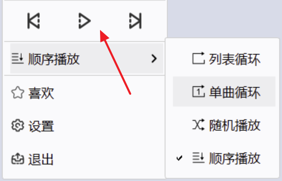
自定义菜单项 大多数情况下,上述常规的菜单项就可以满足要求,但在有些情况下,我们的菜单项可能由更加复杂的 Widget 组合而成,比如下面播放器的菜单:
我们可以使用QWidgetAction来实现上述菜单效果,QWidgetAction可以将一个 QWidget 放入菜单项的容器内,从而实现自定义菜单项。
下面代码定义了一个包含 3 个按钮的菜单项,点击按钮会弹出对话框:
1 2 3 4 5 6 7 8 9 10 11 12 13 14 15 16 17 18 19 20 21 QWidgetAction* action7 = new QWidgetAction (this ); { QWidget* widget = new QWidget (); QHBoxLayout* hl = new QHBoxLayout (widget); auto createPushButtonFn = [this ](QString title) { QPushButton* btn = new QPushButton (title); connect (btn, &QPushButton::clicked, this , [this ]() { QMessageBox::information (this , "Clicked" , ((QPushButton*)sender ())->text ()); }); return btn; }; hl->addWidget (createPushButtonFn ("Button1" )); hl->addWidget (createPushButtonFn ("Button2" )); hl->addWidget (createPushButtonFn ("Button3" )); action7->setDefaultWidget (widget); } menu->addAction (action7);
效果如图所示:
我们也可以使用 QSS 对菜单项内的控件进行样式设置,如:
1 2 3 4 5 6 QMenu QPushButton { border : none; border-radius : 10px ; background-color : black; color : white; }
📌 限于篇幅,不在此提供完整的示例代码,如需获取完整的示例代码,可以联系我
弹窗外部点击时自动关闭 在 Qt 编程中如何实现当鼠标点击弹窗外部区域时,该弹窗可以自动关闭的效果。
ActivationChange 事件 弹窗通过监听 Activation 改变事件,来判断自身是否还是当前的活动窗口,如果不是则关闭自身。
在 QWidget 里面重写 event,捕获 QEvent::ActivationChange 事件:
1 2 3 4 5 6 7 8 9 bool UserCenterDlg::event (QEvent* e) if (e->type () == QEvent::ActivationChange) { QWidget* curActiveWin = QApplication::activeWindow (); if (curActiveWin != this ) { this ->close (); } } return QWidget::event (e); }
Qt::WA_NoMouseReplay 介绍
摘自 Qt 帮助文档:
Qt::WA_NoMouseReplay: Used for pop-up widgets. Indicates that the most recent mouse press event should not be replayed when the pop-up widget closes. The flag is set by the widget’s author and cleared by the Qt kernel every time the widget receives a new mouse event.
Qt::WA_NoMouseReplay 属性可以用来避免如下情况的发生:
由于 Qt::WA_NoMouseReplay 属性只对具有 Popup 属性的 Widget 起作用,因此只能使用 QWidget,不能使用 QDialog,并设置 Qt::Popup 属性。
1 setWindowFlags (windowFlags () | Qt::Popup);
何时设置 Qt::WA_NoMouseReplay 属性了?
重写 mousePressEvent,在鼠标按下事件发生时,设置 Qt::WA_NoMouseReplay 属性。
1 2 3 4 void UserCenterDlg::mousePressEvent (QMouseEvent* e) setAttribute (Qt::WA_NoMouseReplay); QWidget::mousePressEvent (e); }
自定义 closed 信号 QWidget 没有关闭信号,我们可以自定义关闭信号,该信号在 closeEvent 中触发。
1 2 3 4 void UserCenterDlg::closeEvent (QCloseEvent* e) emit closed () ; QWidget::closeEvent (e); }
QPixmap 使用要点
QPixmap::size() 值与程序的 devicePixelRatio 无关,输出的是图片原始尺寸。
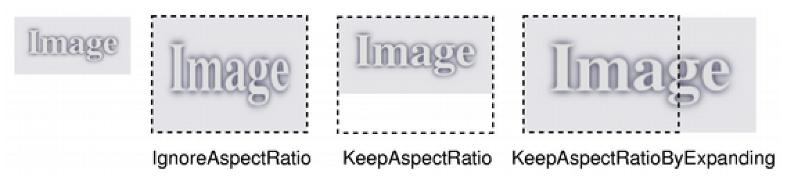
AspectRatioMode 取值:
Qt::IgnoreAspectRatio 忽略图片原长宽比,将图片缩放到指定尺寸
Qt::KeepAspectRatio 在保持图片原长宽比和图片所有元素的情况下,尽量填充满目标矩形。
Qt::KeepAspectRatioByExpanding 在保持长宽比的情况下,拉伸图片保证填充满目标矩形,可能会舍弃部分图片元素。
scaledToWidth、scaledToHeight 函数可以实现在保持原图片长宽比的前提下,将图片缩放到指定的宽或者高。
drawPixmap 函数的参数从左到右依次是:目标区域 -> pix -> 源区域。目标区域会考虑当前 Widget 的 devicePixelRatio,而源区域则与 devicePixelRatio 无关。
开启程序 DPI 缩放 1 2 3 4 5 QGuiApplication::setAttribute (Qt::AA_EnableHighDpiScaling); QGuiApplication::setAttribute (Qt::AA_UseHighDpiPixmaps); #if (QT_VERSION >= QT_VERSION_CHECK(5, 14, 0)) QGuiApplication::setHighDpiScaleFactorRoundingPolicy (Qt::HighDpiScaleFactorRoundingPolicy::PassThrough); #endif
QPixmap::devicePixelRatio 首先 QPixmap::devicePixelRatio 仅适用于开启了 DPI 缩放的程序。
高分辨率版本的图片有大于 1 的设备像素比(即 QPixmap::devicePixelRatio),如果该值匹配底层 QPaintDevice 的值,它将直接绘制到设备上,而不应用额外的转换。
该值用于指定当前 QPixmap 图片是基于 1 倍图的几倍缩放图。
需要注意的是,在使用drawPixmap函数时,如果该目标区域参数未指定宽和高,QPixmap::devicePixelRatio 才生效。
如下面的 drawPixmap 原型:
1 2 3 4 5 6 7 void QPainter::drawPixmap (int x, int y, const QPixmap &pixmap, int sx, int sy, int sw, int sh) void QPainter::drawPixmap (const QPointF &point, const QPixmap &pixmap, const QRectF &source) void QPainter::drawPixmap (const QPoint &point, const QPixmap &pixmap, const QRect &source) void QPainter::drawPixmap (const QPointF &point, const QPixmap &pixmap) void QPainter::drawPixmap (const QPoint &point, const QPixmap &pixmap) void QPainter::drawPixmap (int x, int y, const QPixmap &pixmap)
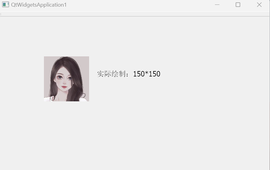
示例(程序已开启 DPI 缩放):
1 2 3 4 5 6 7 8 9 10 11 12 void QtWidgetsApplication1::paintEvent (QPaintEvent* e) qDebug () << this ->devicePixelRatioF (); QPainter painter (this ) ; QPixmap pix ("D:\\gril.png" ) ; pix.setDevicePixelRatio (4 ); painter.drawPixmap (QPoint (100 ,100 ), pix); }
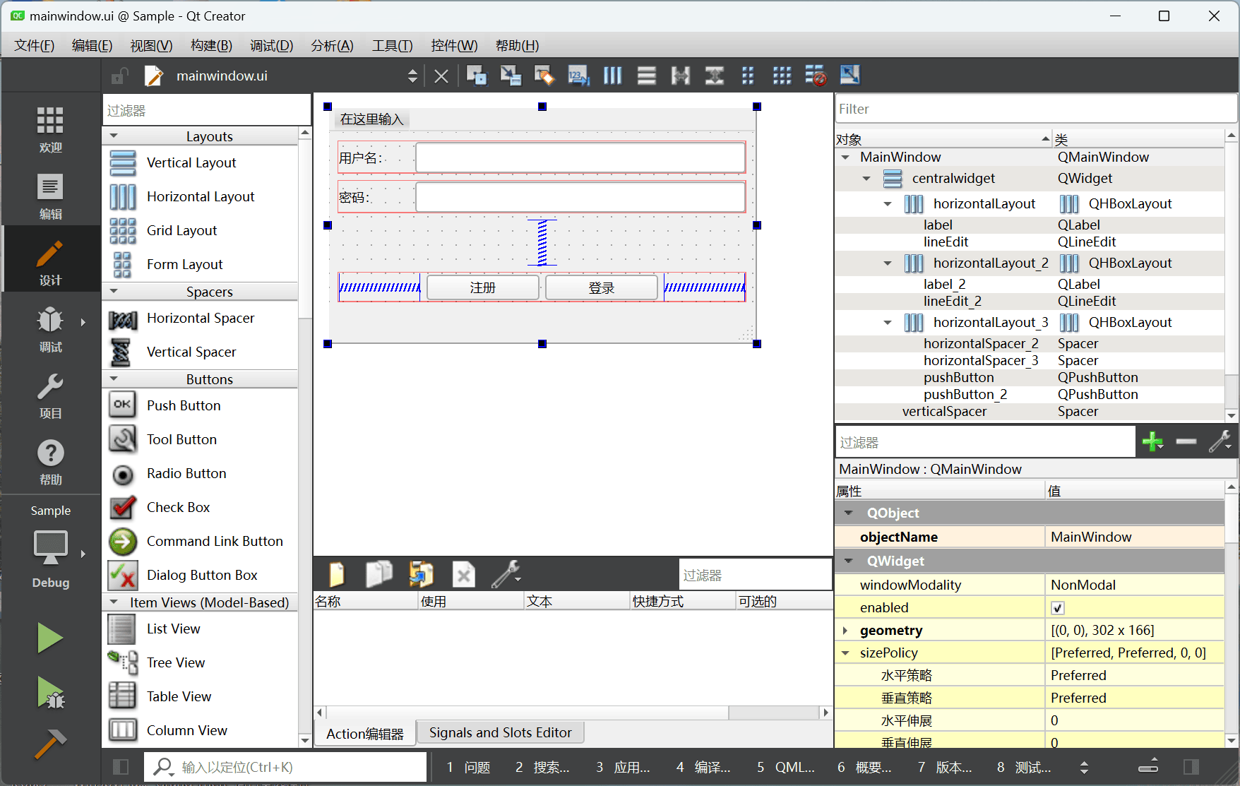
Qt 的布局技巧 手动拖放 通过在 Qt Designer 中手动拖放控件,可以快速实现界面布局,如下图所示:
这种方式对初学者非常友好,可以快速上手开发一个界面,增加成就感。但我们需要知道,拖放布局不是 Qt 布局的全部,这种方式仅适合简单的界面布局。
在实际的项目开发中,界面上的控件会比上面示例中的多得多,布局也会更加复杂,而且界面通常还需要反复地调整。在这种情况下,如果继续通过手动拖放的方式来进行布局,在每次界面调整时,我们都需要打破(分拆)原有的布局,并在修改完成之后重新进行布局,可能还需要重新设置布局的 Spacing 和 ContentsMargins,每一次修改都非常费劲。
题外话:手动拖放控件对手的稳定性要求较高,可能手稍一抖,整个布局就错乱了,又得还原了重新来。
代码布局 我通常使用代码的方式来进行 Qt 界面布局,例如下面的代码实现了与上面示例一样的布局效果:
1 2 3 4 5 6 7 8 9 10 11 12 13 14 15 16 17 18 19 20 21 22 23 24 25 26 27 28 QLabel* lblUserName = new QLabel ("用户名: " ); QLabel* lblPassword = new QLabel ("密码: " ); QLineEdit* editUserName = new QLineEdit (); QLineEdit* editPassword = new QLineEdit (); QPushButton* btnLogin = new QPushButton ("登录" ); QPushButton* btnRegister = new QPushButton ("注册" ); QHBoxLayout* hUserName = new QHBoxLayout (); hUserName->addWidget (lblUserName); hUserName->addWidget (editUserName); QHBoxLayout* hPassword = new QHBoxLayout (); hPassword->addWidget (lblPassword); hPassword->addWidget (editPassword); QHBoxLayout* hButton = new QHBoxLayout (); hButton->addStretch (); hButton->addWidget (btnRegister); hButton->addWidget (btnLogin); hButton->addStretch (); QVBoxLayout* vMain = new QVBoxLayout (); vMain->addLayout (hUserName); vMain->addLayout (hPassword); vMain->addStretch (); vMain->addLayout (hButton); this ->setLayout (vMain);
大家看到上面代码后,第一感觉肯定是“我的个老天,这么复杂”,这个可以理解。但这种方式的好处也非常明显,比如灵活性更大,后期调整、复用、维护也更加方便,而且对于自定义控件比较多的界面,这种方式可以直接创建对应类型的实例,不需要在设计器上进行类型提升。
布局描述语言 我在这里不是为了创造一种新的语言,而是受到了 Flutter 界面布局方式的启发,对 Qt 的布局进行了封装,简化了上述布局代码。
下面是上述示例简化后的布局代码:
1 2 3 4 5 6 7 auto layout = VBox ( HBox (lblUserName, editUserName), HBox (lblPassword, editPassword), Stretch (), HBox (Stretch (), btnRegister, btnLogin, Stretch ())); setLayout (layout);
从代码量来看,明显少了很多,而且我们还可以通过代码的层次结构快速看出界面的布局结构。
在此省略了 VBox、HBox 等类的实现代码,如果您对上述 Qt 布局方式的具体实现感兴趣,可以联系我。
图片按九宫格模式缩放 我们在缩放图片时,都期望能保持图片的原长宽比,因为这样可以防止图片变形,但往往事与愿违,有些时候我们没办法保持原图的长宽比不变,比如需要在保持图片高度不变的情况下,仅横向拉伸图片,此时就会导致图片变形。
为了解决这种问题,我们可以考虑使用九宫格模式进行图片的缩放。
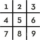
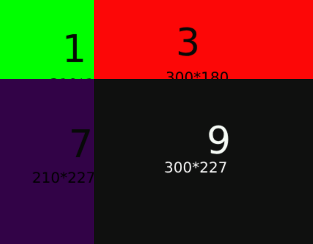
九宫格模式就是将图片切分为九块(不强制切分的每一块必须等分),如下图所示,在图片缩放时,我们通常保持 1、3、7、9 四个顶点位置的图片不变,对 2、4、5、6、8 五个区域进行缩放。
使用 QSS 实现 在 Qt 中实现图片按九宫格缩放最简单的方法是使用 QSS 的border-image属性来实现,通过上下左右四个边框的宽度或高度来设置 1、3、7、9 四个顶点的大小。
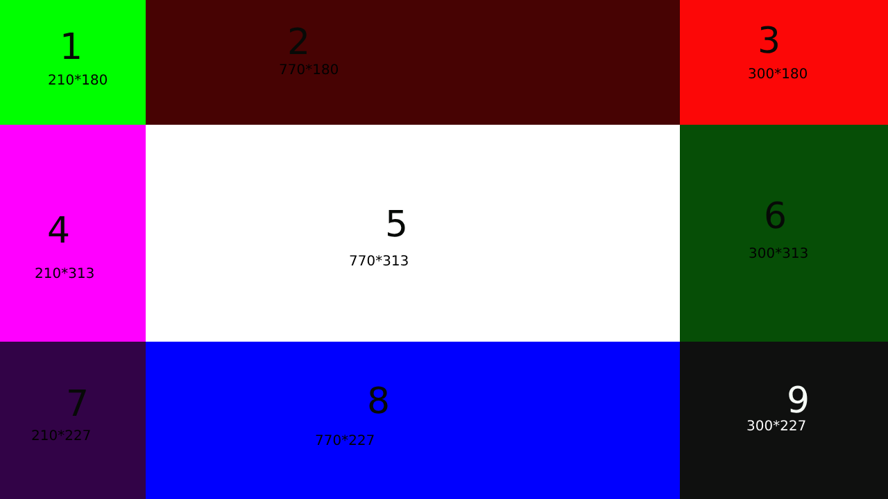
1 2 3 4 5 border-image : url (:/Sample/image/NinePatchTest.png );border-left : 210px ;border-top : 180px ;border-right : 300px ;border-bottom : 227px ;
为了便于测试,我制作了一个九宫格测试图片(整个图片的宽高为 1280*720):
通过这种方法实现的九宫格缩放有一个弊端:
该方案会始终保持 1、3、7、9 四个区域图片的宽高不变,如 1 号区域是210*180,当我们对图片进行放大时,这个行为是没有问题的,但当我们缩小图片时,缩小后的图片宽高不足以容纳 4 个顶角图片时,缩小操作就会出现非预期的行为,可能如下图所示:
这种弊端还会体现在支持高 DPI 缩放的 Qt 程序中,例如在一个支持 DPI 缩放的程序中,为宽高为640*360的 QWidget 设置背景图片,我们知道不同的 devicePixelRatio 会导致实际渲染的图片宽高不同,如 devicePixelRatio 为 1 时,图片渲染区域为640*360, 而 devicePixelRatio 为 2 时,实际渲染区域为1280*720,为了保证程序在不同 DPI 的环境下都有比较好的界面呈现,我们通常简单得指定一个倍图(如 2 倍图)让程序自动进行图片缩放(当然也可以使用 SVG 或针对不同 DPI 使用不同的图片)。
而使用 border-left 等属性指定的宽度是固定的,顶点图片无法参与到自动缩放中来,从而会导致这一 DPI 适配机制失效。下一节介绍的方法可以解决这一弊端。
使用代码实现九宫格缩放 本节介绍如何使用代码来实现九宫格模式缩放图片,实现原理大致如下:
提取九个区域的图片,保持 1、3、7、9 四个图片不变,对 2、4、5、6、8 五个区域图片进行缩放,分别得到新的图片,最后再将九个区域的图片合并成一张图。
为了解决上述 QSS 方案的弊端,我们可以采取先将图片在保持长宽比的情况缩放到相应尺寸:
1 QPixmap keepRatioScaledPix = src.scaled (destSize, Qt::KeepAspectRatio, Qt::SmoothTransformation);
由于 keepRatioScaledPix 实际尺寸肯定与我们想要得到的 destSize 不匹配,所以我们再把 keepRatioScaledPix 图片按九宫格模式缩放。
具体实现代码如下:
1 2 3 4 5 6 7 8 9 10 11 12 13 14 15 16 17 18 19 20 21 22 23 24 25 26 27 28 29 30 31 32 33 34 35 36 37 38 39 40 41 42 43 44 45 46 47 48 49 50 51 52 53 54 55 56 57 58 59 60 61 62 63 64 65 66 67 68 69 70 71 72 73 74 75 76 77 78 79 80 81 82 83 84 QPixmap ScaleByNinePatch (const QPixmap& src, QSize destSize, bool keepVertexImageSize, int pos1Width, int pos1Height, int pos3Width, int pos7Height, Qt::TransformationMode mode = Qt::SmoothTransformation) pos1Width = qMax (pos1Width, 0 ); pos1Height = qMax (pos1Height, 0 ); pos3Width = qMax (pos3Width, 0 ); pos7Height = qMax (pos7Height, 0 ); int handlePixW = 0 , handlePixH = 0 ; const QPixmap* handlePix = nullptr ; QPixmap keepRatioScaledPix; if (keepVertexImageSize) { if (pos1Width + pos3Width > destSize.width () || pos1Height + pos7Height > destSize.height ()) return src; handlePixW = src.width (); handlePixH = src.height (); handlePix = &src; } else { const qreal srcW = src.width (); const qreal srcH = src.height (); keepRatioScaledPix = src.scaled (destSize, Qt::KeepAspectRatio, mode); handlePixW = keepRatioScaledPix.width (); handlePixH = keepRatioScaledPix.height (); qreal krsPixWidth = handlePixW; qreal krsPixHeight = handlePixH; pos1Width = krsPixWidth * (qreal)pos1Width / srcW; pos1Height = krsPixHeight * (qreal)pos1Height / srcH; pos3Width = krsPixWidth * (qreal)pos3Width / srcW; pos7Height = krsPixHeight * (qreal)pos7Height / srcH; handlePix = &keepRatioScaledPix; } QPixmap pix1 = handlePix->copy (0 , 0 , pos1Width, pos1Height); QPixmap pix2 = handlePix->copy (pos1Width, 0 , qMax (handlePixW - pos1Width - pos3Width, 0 ), pos1Height); QPixmap pix3 = handlePix->copy (qMax (handlePixW - pos3Width, 0 ), 0 , pos3Width, pos1Height); QPixmap pix4 = handlePix->copy (0 , pos1Height, pos1Width, qMax (handlePixH - pos1Height - pos7Height, 0 )); QPixmap pix5 = handlePix->copy (pos1Width, pos1Height, qMax (handlePixW - pos1Width - pos3Width, 0 ), qMax (handlePixH - pos1Height - pos7Height, 0 )); QPixmap pix6 = handlePix->copy (qMax (handlePixW - pos3Width, 0 ), pos1Height, pos3Width, qMax (handlePixH - pos1Height - pos7Height, 0 )); QPixmap pix7 = handlePix->copy (0 , qMax (handlePixH - pos7Height, 0 ), pos1Width, pos7Height); QPixmap pix8 = handlePix->copy (pos1Width, qMax (handlePixH - pos7Height, 0 ), qMax (handlePixW - pos1Width - pos3Width, 0 ), pos7Height); QPixmap pix9 = handlePix->copy (qMax (handlePixW - pos3Width, 0 ), qMax (handlePixH - pos7Height, 0 ), pos3Width, pos7Height); pix2 = pix2. scaled (qMax (destSize.width () - pos1Width - pos3Width, 0 ), pos1Height, Qt::IgnoreAspectRatio, mode); pix4 = pix4. scaled (pos1Width, qMax (destSize.height () - pos1Height - pos7Height, 0 ), Qt::IgnoreAspectRatio, mode); pix5 = pix5. scaled (qMax (destSize.width () - pos1Width - pos3Width, 0 ), qMax (destSize.height () - pos1Height - pos7Height, 0 ), Qt::IgnoreAspectRatio, mode); pix6 = pix6. scaled (pos3Width, qMax (destSize.height () - pos1Height - pos7Height, 0 ), Qt::IgnoreAspectRatio, mode); pix8 = pix8. scaled (qMax (destSize.width () - pos1Width - pos3Width, 0 ), pos7Height, Qt::IgnoreAspectRatio, mode); QPixmap dest (destSize) ; dest.fill (Qt::transparent); QPainter painter (&dest) ; painter.drawPixmap (0 , 0 , pix1); painter.drawPixmap (pos1Width, 0 , pix2); painter.drawPixmap (qMax (destSize.width () - pos3Width, 0 ), 0 , pix3); painter.drawPixmap (0 , pos1Height, pix4); painter.drawPixmap (pos1Width, pos1Height, pix5); painter.drawPixmap (qMax (destSize.width () - pos3Width, 0 ), pos1Height, pix6); painter.drawPixmap (0 , qMax (destSize.height () - pos7Height, 0 ), pix7); painter.drawPixmap (pos1Width, qMax (destSize.height () - pos7Height, 0 ), pix8); painter.drawPixmap (qMax (destSize.width () - pos3Width, 0 ), qMax (destSize.height () - pos7Height, 0 ), pix9); painter.end (); return dest; }